Flatpay - PERFORMANCE AD CONCEPTS
The objective was to develop scroll-stopping paid ads that clearly communicate Flatpay’s reliability, ease-of-use and modern brand language. The focus was on creating a consistent visual system that works across both static and video formats, while supporting performance-driven goals.
My Role: Visual designer, SoMe optimisation and brand adaptation
Brand Language & Creative Direction
To create ads that felt aligned with Flatpay’s existing identity, I first broke down the visual language that defines their brand. This ensured that every concept, whether static or video, supported their tone, recognizability and performance goals.
Core Visual Principles
Clarity over decoration
Flatpay’s communication relies on bold, simple statements that are instantly readable in fast-scroll environments.
Confidence through typography
Large, weighty headlines create authority without needing extra graphical elements.
Product-first storytelling
Devices and real-business environments are always centered. The product is the hero.
Minimal friction
Layouts stay clean, with plenty of breathing room to match Flatpay’s promise of ease and simplicity.


Feed Ad Concepts (1:1)
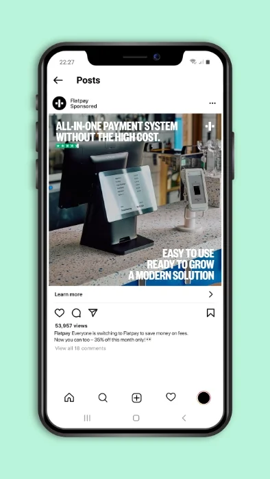


Designed to match Flatpay’s existing paid ads,
with a clear headline-first hierarchy and strong product focus.
Optimized for fast-scroll feed environments.
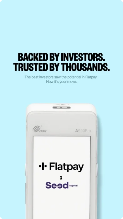
Vertical Ad Concepts (9:16)
Designed for vertical-first platforms, with motion-led hooks, fast message delivery and strong product visibility. Optimized for 9:16 static and video placements.
Outcome & Key Learnings
Consistency within variation
All concepts stay true to Flatpay’s visual system while adapting across static and motion formats.
Production-ready execution
Every concept was designed with real paid media placement in mind.
Format-driven thinking
Each ad was built specifically for its placement, not resized as an afterthought.